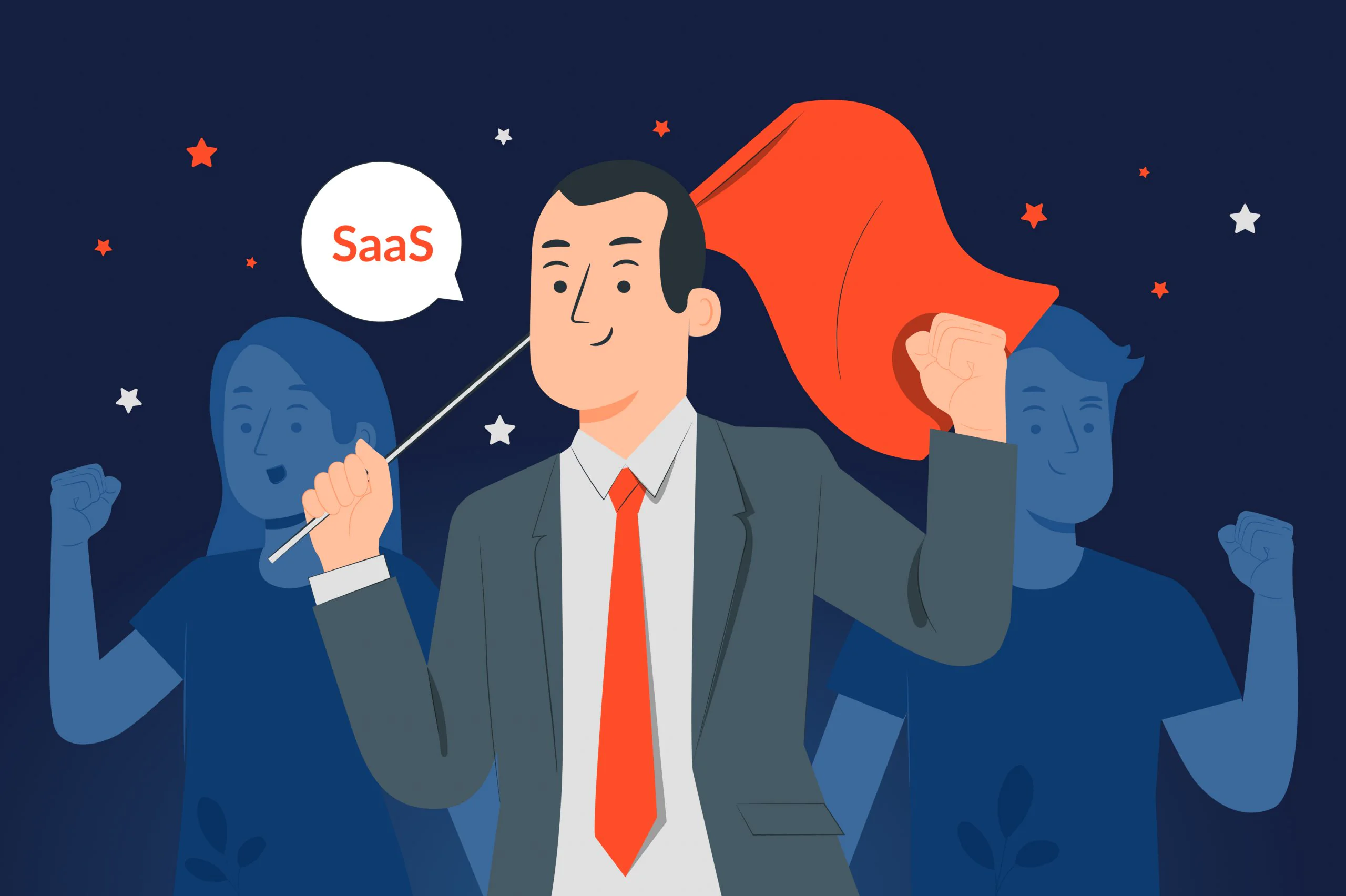
Love. What a weird word to use when talking about user experience (UX) design. But that’s the kind of emotion you must evoke to make people opt for your software as a service (SaaS) solution month after month.
Nir Eyal in his best-selling book Hooked explains that the key task for every SaaS entrepreneur is to create a so-called habit-forming product that causes a dopamine rush. Dopamine is the hormone that helps us feel pleasure in life. Smelling cookies, shopping, exercising, reading the Facebook feed – all these things can cause a dopamine hit. Ideally, your product should be as good as an iced latte on Monday morning, so people couldn’t easily put it down.
We at JatApp are convinced that the most effective way to increase users’ dopamine levels is by creating engaging UX design that rewards clients and makes their lives easier. In this blog post, we’re going to have a teardown of common SaaS design mistakes and reveal how successful companies avoid them.
The importance of UX in SaaS solutions

The role of UX in SaaS development can’t be underestimated. Need some proof? Four arguments listed below will persuade you to splash out on good UX designers.
-
It improves brand reputation
Great application design can make a lasting impression on your customers, making them more likely to think good about your brand. If you’ve managed to attract users’ attention, appeal to their needs, and mimic their behavior, they may automatically assume that you’re helpful and your SaaS is worth subscribing to in the future. Not only will they spend more time using your product, satisfied and focused on the goal they’re pursuing, but also start to subconsciously perceive your company as both reliable and trustworthy.
-
It increases customer loyalty
The UX design is all about users’ emotions and feelings. If customers find your design intuitive and user-friendly, chances are they won’t start wondering what your competitors can offer to them. Therefore, your main goal is to strive to improve the quality of their experience. This will help you turn newly subscribed users into loyal customers that buy your premium services and recommend them to their friends and family members.
-
It can become your competitive advantage
With a killer UX, you can stand apart from your competitors, even if they sell similar solutions at a more competitive price. Uber is a good example of SaaS that manages to stay ahead of the competition partly due to its attractive UX design. Its users can order a taxi with just a few clicks and track their driver as they come to their doorsteps. As easy as that. Most people would prefer Uber over many other transportation companies that have messy UX, even if it means losing a few bucks per ride.
-
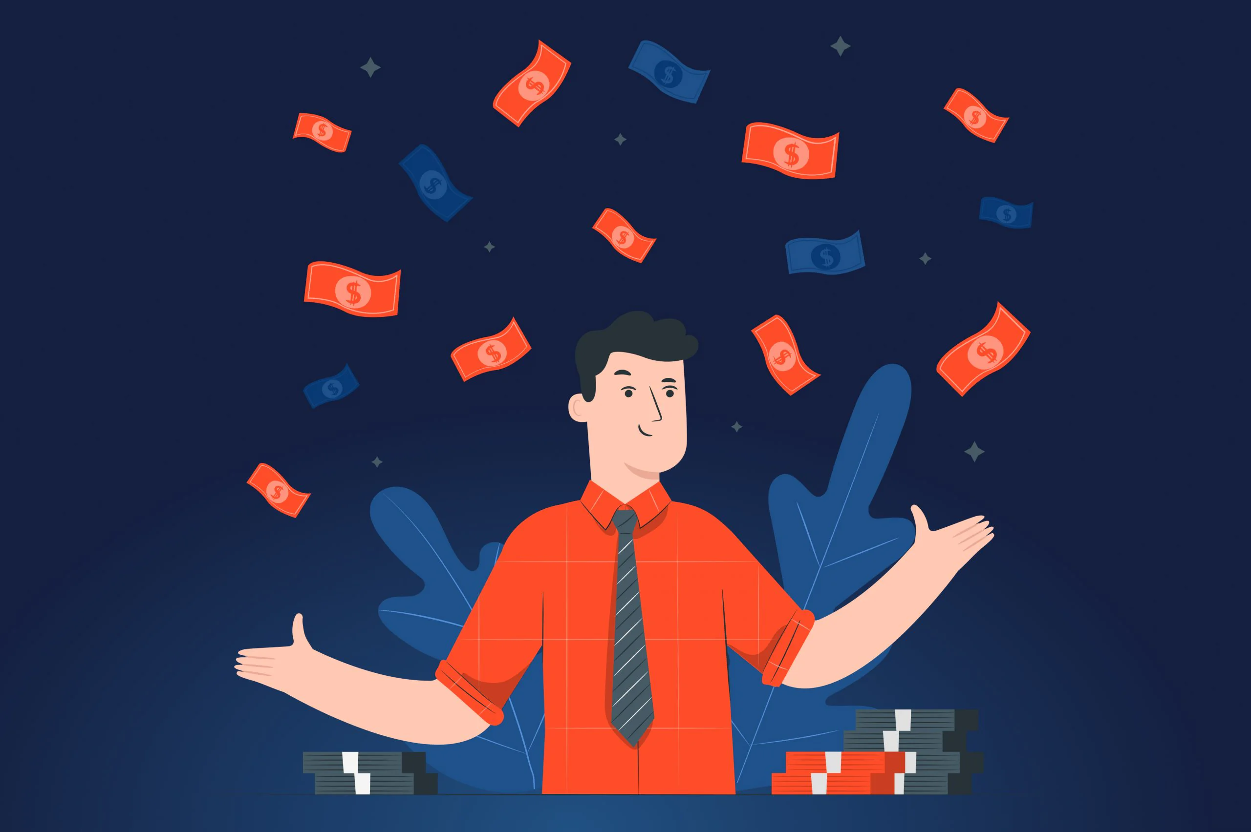
It drives return on investment
The key to users’ hearts is the perfect balance between the ease of use and rich functionality. Customers want to have many useful features at their fingertips, and if you manage to give them what they want, they will buy all your additional services and long-term subscriptions. In a relatively short while, you’ll be able to beat off the capital you invested in talented UX designers.
Seven pieces of advice that won’t do any good to your SaaS
Below, you can find seven pieces of advice that you shouldn’t follow, unless you want to smash your business. We’re also giving you examples of successful SaaS players that are doing the complete opposite, design-wise.
Forget about users’ needs
Disregard your clients’ needs and you’ll turn your app into a poorly oiled car that can’t deliver passengers from point A to point B. Speaking about vehicles, when a person is buying one, the first thing they consider is how they will use it. Would a dad of four need a tiny sedan to take his kids to the sea? Would an empty nester look for a spacious minivan? Probably not one of the smartest choices in both cases.

But what if the father of four uses his car for commuting mostly and the empty nester is volunteering to help transport bed patients? To make the ride truly convenient for passengers, car manufacturers need to know their customers well. Their preferences, habits, lifestyles, marital status – all these things matter when it comes to the car design. The same is true for the SaaS product design.
Kind reminder – you need to think about what your customers need and love rather than about your personal likes and dislikes.

Recently, we saw the importance of understanding who your audience is when working on the UX design for a SaaS client. Pre-Quest, the startup from the United Kingdom, turned to us to build an edtech solution for 6th and 7th grade students. When our team learned that the target audience is kids, we decided to focus heavily on UX to make sure that the product is appropriate for the young age. To engage users, we allowed them to set pandas as their profile photos and added images of different animals in their natural environment.

Pre-Quest design appropriate for 6th-7th grade students
Our designers also understood that some kids would need supervision to start caring a bit more about their exams. Therefore, we also created an account for parents, so they could track the progress of their child.

Pre-Quest parent account
Ask users do the math
It’s always a nice idea to kindly ask your potential users to calculate how much they would owe you when they opt for the base version plus additional services. Especially when the prices for these services aren’t rounded numbers… If at this moment you’ve realized that most of your users aren’t math majors, please, don’t expect anyone to ever bother calculating the final costs, because, as a rule, nobody will. If you have the base and add-on pricing plans, you need to show the total amount of money a user needs to pay per month.
A streaming service, Hulu, made such an epic mistake and ended up losing many subscribers to Amazon Prime Video that carefully did all calculations for their users. We’re here not to blame anyone, but Hulu’s approach to UX can seem suspicious to many. Hiding the total sum could make users think that the company wants them to lose track of their spending.

Amazon Prime Video pricing plans
Make the signup process a hell on Earth
Pry out your clients’ entire biography. You need to know every little detail about your customers before letting them use your solution. This is actually a good piece of advice for someone who wants to scare away clients right from the start. But as users typically can’t stand to type in too much information to sign up, it’s likely that they won’t even begin using your product.
FreshBooks is a SaaS company that has a very simple and clear registration process. A user only needs to provide their email address to become a part of the club. Even though the initial registration doesn’t take much time, the company gets more details after they start to use the app. Such stepped data collection is one of the SaaS UX best practices that help to remove barriers to entry.

Registration on FreshBooks
Don’t bother about user onboarding experience
Another piece of bad advice is to ignore onboarding that shows users how your app works. Even if they get frustrated and confused, don’t bother. A bit of annoyance has never killed anybody.
Sounds wrong, doesn’t it? The first impression can dramatically become the last one, if your solution lacks proper onboarding. You need to help your users complete tasks in your solution effortlessly. Period. If your clients can’t find the functionality they need, they will cancel their membership and never come back.
Slack is an awesome example of SaaS with good onboarding that leaves a strong positive impression on users. The solution provides an artificial-driven (AI) bot called Slackbot. It acts as a support system that answers common questions, such as how to add new users or make a channel. Also, coachmarks (temporary messages that appear on the transparent overlay) and demonstration videos make it easier for users to navigate through the unfamiliar SaaS platform.

Slackbot
Avoid dashboards at all costs
Overwhelm your users with lots of numbers, statistics, and texts. Who needs these colorful SaaS dashboards that structure all the information? Only businesses that want to appeal to their users would agree to do something like that.
Certainly, having some challenges in life may be stimulating and even inspiring, but trust us, this is hardly relatable to the UX design. If you don’t bother about making complex information easy to understand, consider it done with your SaaS business.
One of our German clients contacted us to outsource their UX design. Since the startup wanted to create an AI-powered building energy management system, the main task was to design the SaaS application with easy-to-read dashboards that would give a bird-eye view on the current building energy performance.

Building energy management system dashboard
Our team built dashboards that offer information to multiple stakeholders. More specifically, permissions can be provided to access a specific tab or form. For instance, a person held accountable for the heating system doesn’t need to view the data related to air conditioning. This way, stakeholders can use the system without being confused with unnecessary information.
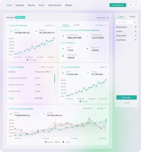
Building energy management system filters
Like any great dashboard, this app shows what the user’s current state is, their recent activity, problems they need to be aware of, and so on. When a user clearly sees how much energy is spent and saved in what buildings and compares this with the data earlier this month or year, they can make a more informed decision regarding energy usage. Furthermore, we also created a system of widgets that each user can filter according to their preferences to make navigation through the dashboard even more seamless.

Building energy management system widgets
Let users figure everything out on their own
If users get stuck, it’s none of your concern. If they decide that they need assistance, it’s highly likely that they are already frustrated and nervous. Why on Earth would you want to deal with someone who is already annoyed?
Here is why. Providing assistance is one of the major factors that determine SaaS longevity. Modern users are not willing to waste their time talking to strangers over the phone to clarify something they don’t get. They expect to find all the answers right in the app. Making them dig for answers is the key to ruining their experience with your app. Meanwhile, if the help is always by hand, users are likely to appreciate it, viewing you as a hero of the day.
Our client can stand as an on-point example of how every SaaS startup should offer help to its users. The company provides a tutoring platform for homework help, connecting students with qualified teachers. Clearly, if learners are searching for tutors online, they might have lots of doubts and concerns as for the quality of their services. With this in mind, we included the section with frequently asked questions (FAQ) on the students’ internal panel. As a result, if something is bugging a learner, there’s always help available in the right corner of the page.

FAQ on the online tutoring platform
No fun, UX is a serious business after all
Games will make you seem unprofessional and lighthearted. You need to show that your solution is here for users not to have fun, but finish serious tasks. Right?
Not at all, as in reality, gamification can be essential, especially if we’re talking about edtech solutions. Allowing your customers to have fun helps them complete complex and sometimes daunting tasks. It can not only entertain your users but also make them excited about your SaaS, so they keep subscribing to your product on a regular basis.
Coming back to Pre-Quest, the app has cool gamification features that keep children focused throughout their learning journey. The main and learning pages are accompanied by music, which turns users’ studying process into a thrilling adventure.
While passing tests, kids receive badges and trophies that encourage them to put even more effort into their learning. They can also compete with each other and view the leaderboard with the progress of other students. All these functionalities have one ultimate purpose – to provide users with a dose of dopamine while they’re working towards their goals.

Pre-Quest gamification features
Earn your users’ love with great SaaS UX
In this article, we’ve covered the worst pieces of advice that a UX designer can ever give to you. By doing the complete opposite of these “recommendations” and following the examples of SaaS companies we’ve described, you’ll be able to earn lots of love from your customers. JatApp can gladly help you with this. Our software development company has been working with SaaS startups for more than seven years now. And we’re proud to say that one of them has just raised a staggering $4.4 million in funding. Also, our clients say many good things about us on Clutch, including that their end customers enjoy the products we’ve put so much effort into.
If you feel like you need some help with your SaaS, don’t hesitate to reach out to us to discuss all project details.