People need your help. They want to make frictionless payments with their smartphones. But, here comes the daily dose of reality check: just building a mobile payments app is not enough.
A mobile payments app should offer a truly painless payment experience. People do expect mobile payments applications to make their lives more comfortable and convenient. Actually, 80% of mobile payments apps users think so, but 76% of them say that the user experience (UX) of their payments apps could have been significantly improved.
The JatApp team is always on the side of entrepreneurs who want to change the world for the better with the power of technology. That is why we would like to help you in your quest by presenting you our in-depth guide on designing mobile payments experiences.
Behind the curtains of UX psychology
Before getting into hands-on recommendations about designing mobile payments experiences, we would like you to pay attention to the psychology of user experience in general. That’s not a dull should-learn theory, but a clear explanation of what you really need to achieve by creating mobile payments app design.
What’s the aim of a user experience design? There are myriads of clever explanations, but we prefer to say that an effective UX design results in a user delight.
There are three categories of user delight: visceral, behavioral, and reflective. Let’s describe each of them:
- Visceral. A spark of a positive affect experienced by a user is a result of a visceral delight. An app’s design should cause positive feelings throughout demonstrating visually pleasant and aesthetic elements a user can see on the screen. Colors, fonts, shapes, placement of navigation elements, and so on need to create a pleasant harmony that comforts a user’s perception.
- Behavioral. A user needs to experience positive feelings from actions they take within the application. For instance, a user accomplishes a particular task with the app faster and easier than expected. The user experiences positive emotions, once their behavior delivered a desired result and exceeded their expectations.
- Reflective. That’s the most complicated type of user delight as it refers to a user’s values. The app can be visually appealing and easy to navigate through, but omitting UX elements that are critical to the app’s target audience can spoil the entire experience. For instance, millennials and Gen Z users are commonly not into finance and banking stuff. That’s why any complex terms and actions within a payments app are likely to make them refrain from using this solution. So you have to carefully study the values, interests, and priorities of your target audience to deliver a valid reflective delight.

Designing mobile payments experiences means that you delight users in these three ways. It would be perfect if you do this simultaneously. And it’s your lucky day, because we have a list of practical recommendations on how to make your mobile payments app design genuinely delightful and match all three categories from above.
Ways to get your users in a comfortable chair that is actually a driver’s seat
We promise, that’s the last introductory word before we start discussing specific hands-on recommendations for designing mobile payments experiences. The UX design of any payments app should make a user feel comfortable because they are dealing with their money, and an unnerving anxiety is a natural hurdle to the user’s delight. But for the same reason, users don’t want to relax too much as they crave control over the whole process of sending their money.
That’s what we want you to bear in mind. And now, we can talk about specific recommendations. The UX design of a mobile payments app should offer the following:
Easily achievable goals
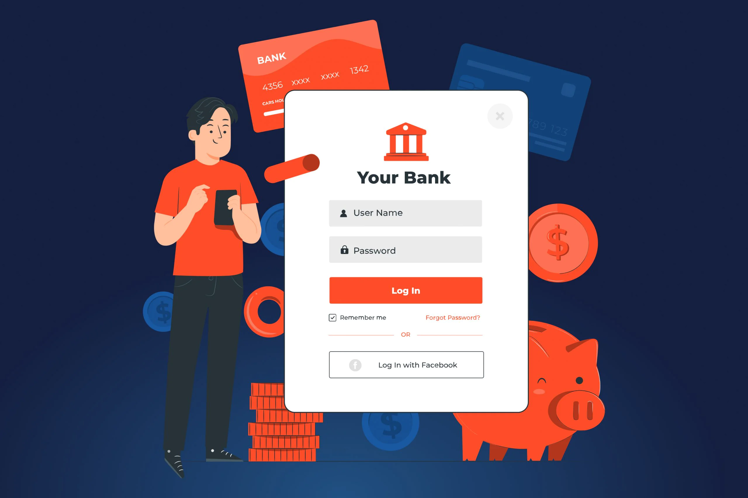
- Quick login. Users need to have quick access to their account’s balance, which is why the process of logging in should be respectively fast. Avoid unnecessary options at this stage, the login screen has to address only one task — to get a user logged in their account. Anything else would be a distraction playing against a delightful UX.

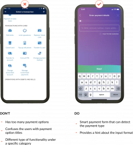
- Frictionless money transfer. Simplicity and effortlessness are your best friends here. Users expect to complete money transfers in no time. You need to shorten this path as much as possible. The best way to do this is to automate selection of a payment method. A user just needs to enter payment details while the app will recognize whether it is a wire transfer, cross-border payment, Paypal, crypto payment, or any other payment method your application is compatible with.

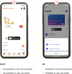
- Copying card number. There is nothing more frustrating than entering your own card credentials manually. Yes, we’ve got lazy to the point when extending an arm and taking a credit card out of the wallet is a big deal. On top of that, a nervous check whether each digit of the card credentials were properly entered is devastating. By adding a feature of copying card credentials, the UX design of your app will relieve one more pain users commonly face.

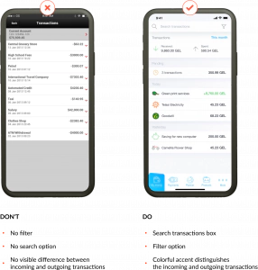
- Visible transactions history. Users want to see instantly where and how much money goes to and from their accounts, which means transaction history should be easy to find and view. Details about transactions such as time, amount, and recipient/sender are valuable to users because this information doesn’t let them get lost in tons of payments. Since the majority of users tend to have more outcoming payments than incoming ones, there is no need to separate them. Instead, distinguishing them with different colors will be enough. For instance, you can highlight outcoming payments in red and incoming payments in green.

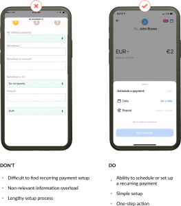
- Convenient recurring payments planning. Many users’ payments are regular, and that’s where you can amuse your customers by adding a feature of recurring payments. It is important that the app specifies both the payment amount and the timing for recurring payments. We suggest you provide users with short one-step actions they should complete to plan a recurring payment, so at every next screen they set one more option.

Reliable security
- Know Your Customer (KYC). KYC data is basic personal information about a user that proves their identity. Most banks provide fintechs with KYC data via application programming interfaces (APIs). By leveraging KYC, you protect your app from fraudsters as they’ll be unable to access the app without confirming their identity.
- Biometric authentication. Since we are talking about payments done with a smartphone, you can make your product rest secure with biometric authentication. Almost any smartphone uses biometric authentication for securing smartphones, which is why various eye/face/fingerprint recognition technologies can be a bulletproof protection for your payments app.
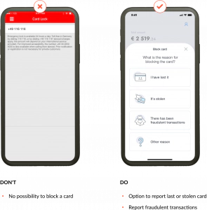
- Ability to instantly block a card. Whatever security measures you take, fraudsters will try to be one step ahead, and users will still suffer from illegal access attempts to their banking credentials. You can help users prevent this by enabling them to instantly block their account or card as soon as they suspect that their banking data got into the hands of bad actors. This feature has to be something like a red button for alert. Ensure the option of card blocking is easy to find and the card gets blocked immediately without contacting the bank’s support.

Feedback and clarity
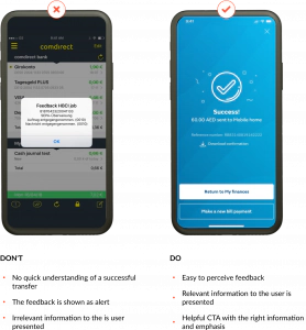
- Feedback on important actions. Once users want to have a firm control over what they do with their money, it’s essential to provide them with feedback on transactions and other important actions they do with your app. Users need to ensure that a transaction is successful, and in case it’s not, they should know what to do next. Use simple and unambiguous language that clearly tells about the status of a transaction or instructs a user about next steps.

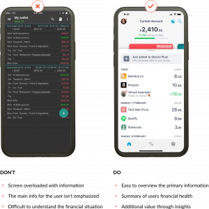
- Easy-to-check balance. Checking the balance is perhaps one of the most frequent actions users do with financial applications. That’s why it makes sense to view balance at the main dashboard. Again, a simple and clear manner of showing a user’s balance will be a smart UX decision for your product. A user doesn’t have to take a hard effort to distinguish their balance from other financial data.
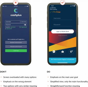
- Convenient dashboard view. This recommendation goes hand in hand with the previous one. Overloading the screen with too much data will only confuse and overwhelm users, thereby making them anxious and unconfident whether they take the right actions to send money. A simplistic view of key financial data is enough for a user’s delight. That’s the case when the “the more is less” principle perfectly works.

Training and rewards
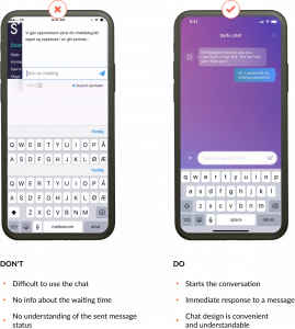
- Customer support available 24/7. Having constant customer support is good for any app, but in case with mobile payments the importance of timely user support is extremely high. The reason is the same: people are naturally anxious about their hard-earned money. When something goes wrong with payments and users can’t fix it themselves, customer service should be available in one click. It’s possible that all your support managers are busy, so many users will have to wait. Don’t abandon these users by saying that the whole support team is currently busy. Instead, inform users about an approximate waiting time or offer to reschedule a call as soon as anyone from the support team becomes available.

- Tutorials. Even though you manage to keep your mobile payments app simple, it is still a financial app, and your users will fear to touch the wrong button. For that reason, embedding training and tutorials about how to use the app is another must for your product. In such a way, users will learn that your app is really easy to use while you ensure that you get new users onboard.
- A barriers-free rewards system. Rewarding users for choosing your app is a good icing on the cake you can add for making the user experience more pleasant. However, getting and spending these rewards should be another no-brainer. Awarding $1 for making a million of transactions over $100,000 won’t impress your customers. Likewise, redeeming bonuses shouldn’t be a challenge: any limits or other barriers will only annoy the users.
Remember — the devil is in the details
When it comes to app design, being meticulous is probably one of the most crucial things. That is why you should carefully examine the design of your mobile payments app and tweak any nuances that can spoil user experiences. But if you believe that you could get some help from professionals to be on the safe side, you can always turn to JatApp.
We hold the UX devil by both horns as our company has been developing fintech solutions since 2015, and 99% of our customers were satisfied with the results we delivered. We have worked on designs for more than 200 products, amongst which were such fintech solutions like a payroll app, payment gateway, and bill splitting application.

Revolutionize the way people pay with your user-centric mobile payments app. Contact us now to get started!